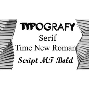
Understanding Typography

When it comes to designing print materials, typography is one of the most important elements to consider. Typography refers to the art and technique of arranging type in order to make written language legible, readable, and appealing when displayed. In this guide, we will cover the fundamentals of typography and how you can use it to create visually stunning and effective print materials.
- Font Families The first step in understanding typography is to become familiar with font families. A font family is a group of typefaces with a similar design that share common characteristics such as weight, style, and proportion. There are several popular font families, including serif, sans-serif, script, and display. Each font family has its own unique characteristics and can be used to convey a different tone or mood in your print materials.
- Typeface is a specific style or design of a font family. For example, Times New Roman is a typeface within the serif font family. When choosing a typeface, it is important to consider the mood or tone you want to convey. Serif typefaces are typically used for traditional or formal print materials, while sans-serif typefaces are more modern and casual.
- Kerning and leading are two important concepts in typography that can greatly affect the legibility and appearance of your print materials. Kerning refers to the space between individual characters in a word or phrase. Adjusting the kerning can help improve the overall balance and readability of the text. Leading, on the other hand, refers to the space between lines of text. Adjusting the leading can help improve the readability and flow of the text.
- Choosing the Right Typeface When choosing a typeface, it is important to consider the overall design and purpose of your print materials. Serif typefaces are typically used for formal or traditional print materials, such as books or invitations. Sans-serif typefaces are more modern and casual, making them a good choice for websites or marketing materials. Script typefaces can add elegance and sophistication to your print materials, while display typefaces are bold and attention-grabbing.
- Balance and Hierarchy Typography can also help create balance and hierarchy in your print materials. By varying the font size, weight, and style, you can create a visual hierarchy that guides the reader’s eye and emphasizes important information. It is important to strike a balance between too much variation, which can be overwhelming, and too little variation, which can be monotonous.
Understanding typography is essential for creating visually stunning and effective print materials. By choosing the right font family and typeface, adjusting the kerning and leading, and creating a balance and hierarchy, you can create print materials that are both aesthetically pleasing and easy to read.
Reach out to get a book quote with PRC Book Printing by calling 888.659.8320. You can also request a quote by filling out our online form.
REQUEST A QUOTE!
For more Information do not HESITATE — contact PRC BOOK PRINTING NOW!
CALL 888.659.8320 or Email us!
