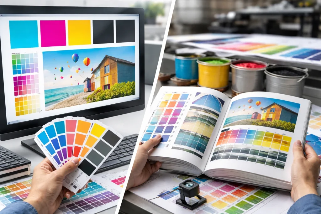
Screen colors don’t match printed colors because monitors display color using RGB light (Red, Green, Blue), while professional printing creates color using CMYK ink (Cyan, Magenta, Yellow, Black)—two fundamentally incompatible systems with different color ranges. The vibrant electric blue on your monitor may not exist in the CMYK color space, meaning your printer must substitute the closest available alternative, which often appears duller, darker, or shifted toward an unexpected hue.
This color mismatch surprises thousands of authors every year. You’ve spent months perfecting your cover design, approving illustrations, and fine-tuning food photography. The colors look perfect on screen. Then your printed books arrive, and the bright orange sunset has turned muddy brown, the vivid purple has shifted toward magenta, and the crisp greens look flat and lifeless. The disappointment is real—and it was preventable.
This guide explains exactly why color mismatch happens, how to predict and prevent it, and what workflow changes ensure your printed book matches your creative vision. With over 30 years of combined experience helping authors achieve accurate color reproduction on Heidelberg presses, the PRC Book Printing team has guided countless projects through color management challenges to successful, vibrant results.
What You’ll Learn
- What Are Color Profiles and Why Do They Matter?
- Why Screen and Print Colors Never Match Perfectly
- The Real Causes Behind Color Disappointment
- How to Identify Color Problems Before Printing
- Solutions for Accurate Color Reproduction
- Expert Tips from PRC Book Printing
- Frequently Asked Questions
- Next Steps: Get Color-Accurate Printing
What Are Color Profiles and Why Do They Matter?
A color profile is a standardized description of how a device—monitor, printer, camera, or scanner—reproduces color. Color profiles translate color data between devices, ensuring that “red” on your camera, your monitor, and your printed page all refer to the same actual color.
The two color systems you need to understand:
RGB (Red, Green, Blue): Used by all screens—monitors, phones, tablets, TVs. RGB creates color by adding light. When red, green, and blue light combine at full intensity, you see white. RGB can display approximately 16.7 million colors, including highly saturated, vibrant hues that seem to glow from within.
CMYK (Cyan, Magenta, Yellow, Black): Used by professional printing. CMYK creates color by subtracting light—ink absorbs certain wavelengths and reflects others. When cyan, magenta, yellow, and black combine at full intensity, you see black. CMYK can reproduce approximately 16,000 colors—dramatically fewer than RGB.
Why this matters for your book:
Every image on your screen exists in RGB. Every printed page exists in CMYK. The conversion between these systems is where color problems originate. Colors that exist in RGB but not in CMYK must be approximated, and those approximations often disappoint authors who didn’t understand the limitation before seeing their printed books.
Why Screen and Print Colors Never Match Perfectly
Understanding the fundamental incompatibility between screen and print color helps you set realistic expectations and make informed decisions.
The Gamut Problem
“Gamut” describes the range of colors a system can reproduce. RGB’s gamut is significantly larger than CMYK’s gamut. Imagine RGB as a large circle and CMYK as a smaller circle inside it. Colors inside both circles convert accurately. Colors in the RGB circle but outside the CMYK circle—called “out-of-gamut” colors—cannot be printed as they appear on screen.
Commonly out-of-gamut colors include:
- Electric/neon blues and cyans
- Vivid oranges and bright reds
- Saturated purples and magentas
- Fluorescent yellows and greens
- Any highly saturated, “glowing” color
These colors must be mapped to their closest CMYK equivalent, which is inevitably duller or shifted in hue.
The Light vs. Ink Problem
RGB monitors emit light directly into your eyes. Colors appear to glow. Brightness can be extreme. Saturation can be pushed beyond what physical objects ever display.
CMYK printing applies ink to paper. You see color via reflected light. The paper absorbs some light, the ink absorbs some light, and only what remains reaches your eyes. This physical process cannot achieve the luminous intensity of a backlit screen.
The Viewing Condition Problem
Even if colors matched perfectly, viewing conditions affect perception:
- Monitor brightness and calibration vary dramatically between devices
- Ambient lighting changes how you perceive both screen and print colors
- Paper stock affects printed color appearance (coated vs. uncoated, white vs. cream)
- Ink interaction with specific papers creates unique color behavior
Two people viewing the “same” file on different monitors see different colors. The same printed page viewed under fluorescent office light and warm home lighting looks different. Perfect matching is theoretically impossible—but close matching is achievable with proper workflow.
The Real Causes Behind Color Disappointment
When authors receive printed books with unexpected colors, these are the underlying causes.
Cause #1: Working Exclusively in RGB
Authors and designers who work entirely in RGB—approving images on screen, never converting to CMYK until the printer does it—never see how their colors will actually print until books arrive. The printer’s automated conversion may make different choices than the author would prefer.
This is the single most common cause of color disappointment in book printing.
Cause #2: Late or Improper CMYK Conversion
Converting RGB to CMYK at the wrong point in the workflow, or using inappropriate conversion settings, creates suboptimal results:
- Converting after all editing is complete removes the ability to adjust for color shifts
- Using default conversion settings may not match your printer’s specific requirements
- Converting multiple times degrades color quality progressively
Cause #3: Uncalibrated Monitors
Most consumer monitors are not color-calibrated. Factory settings prioritize visual appeal (punchy, saturated colors) over accuracy. Authors approve colors on screens that don’t display accurate color to begin with, guaranteeing mismatch with any output—print or otherwise.
Cause #4: Ignoring Soft Proofing
“Soft proofing” simulates print output on screen, showing how CMYK conversion will affect your images before printing. Authors who skip soft proofing miss the opportunity to catch and correct color problems while changes are still easy and free.
Cause #5: Paper Stock Mismatch Expectations
Paper dramatically affects printed color. Uncoated paper absorbs ink, creating softer, warmer color. Coated paper holds ink on the surface, creating sharper, more vibrant color. Authors expecting coated-paper vibrancy from uncoated stock will be disappointed—not because printing failed, but because expectations didn’t match material choice.
Cause #6: Not Requesting Physical Proofs
Digital proofs displayed on screen remain subject to RGB/CMYK and monitor calibration issues. Only physical press proofs printed on your actual paper stock show exactly how your book will look. Authors who skip physical proofs sacrifice their best opportunity to verify color before full production.
How to Identify Color Problems Before Printing
Catch color issues before they become expensive mistakes.
Use Soft Proofing
Most professional design software includes soft proofing capabilities:
In Adobe Photoshop: View > Proof Setup > Custom > Select your target CMYK profile > View > Proof Colors
In Adobe InDesign: View > Proof Setup > Custom > Select your target CMYK profile > View > Proof Colors
Soft proofing simulates how your images will appear in CMYK. Areas that shift dramatically need attention.
Check Gamut Warnings
Photoshop and other applications can highlight out-of-gamut colors:
In Adobe Photoshop: View > Gamut Warning
Out-of-gamut areas appear in gray overlay, showing exactly which colors will shift during conversion.
Convert to CMYK and Compare
Create a CMYK copy of your file and place it beside the RGB original. Examine areas of high saturation—these show the most shift. If the CMYK version looks acceptable, you’re likely safe. If key colors look wrong, adjustments are needed before printing.
Examine Problem-Prone Areas
Certain image types consistently cause color issues:
- Bright skies with saturated cyan/blue
- Sunsets with vivid orange/red gradients
- Neon signs or glowing objects
- Fashion photography with saturated clothing
- Food photography with bright produce
- Children’s illustrations with saturated primary colors
- Nature photography with vivid greens
Request a Physical Proof
For color-critical projects—children’s books, cookbooks, photography books, art books—request a physical proof printed on your actual paper stock. This is the only definitive way to verify color before production.
Solutions for Accurate Color Reproduction
Preventing color problems requires workflow changes at every stage.
Solution #1: Work in CMYK from the Start
When possible, set up your project in CMYK from the beginning:
- Create documents in InDesign or Illustrator using CMYK color mode
- Request CMYK files from illustrators before work begins
- Convert photographs to CMYK early, allowing time for adjustment
Working in CMYK eliminates conversion surprises because you see print-realistic color throughout your process.
Solution #2: Convert RGB to CMYK Yourself
If you must work in RGB (some software or workflows require it), convert to CMYK yourself rather than leaving conversion to your printer:
- Use appropriate CMYK profile (ask your printer which they prefer)
- Convert using “Perceptual” or “Relative Colorimetric” rendering intent
- Examine results and adjust colors that shifted unacceptably
- Make adjustments while you still have creative control
Solution #3: Calibrate Your Monitor
Professional monitor calibration using a hardware colorimeter ensures your screen displays accurate color:
- Basic colorimeters ($150-$250) significantly improve accuracy
- Professional colorimeters ($300-$600) provide maximum precision
- Calibrate monthly to maintain accuracy as monitors drift over time
Even basic calibration dramatically improves your ability to predict print results.
Solution #4: Use Soft Proofing Religiously
Make soft proofing standard practice for every print project:
- Obtain the correct CMYK profile from your printer
- Apply it in your soft proofing setup
- Review every image in soft proof mode before finalizing
- Adjust images where soft proofing reveals problems
This habit catches 90% of color issues before they reach production.
Solution #5: Choose Appropriate Paper Stock
Select paper stock that supports your color goals:
- Coated matte or gloss paper for maximum color vibrancy and accuracy
- Uncoated paper for warmer, softer color with traditional book feel
- Premium coated stocks for photography and art books demanding precise reproduction
Discuss paper options with your printer before finalizing files. PRC Book Printing’s team helps you select paper that achieves your color goals within your budget.
Solution #6: Request Physical Proofs
For critical color work, request a printed proof on your actual paper stock:
- Physical proofs show exactly how your book will print
- Compare proofs to your original artwork/photographs
- Request corrections if needed before full production
- Approve with confidence knowing what you’ll receive
Solution #7: Trust Professional Offset Printing
Professional offset printing on Heidelberg presses delivers superior color accuracy and consistency compared to digital printing or print-on-demand. Heidelberg’s precision color management, combined with skilled press operators, reproduces color faithfully across your entire print run—every copy identical to your approved proof.
Expert Tips from PRC Book Printing
Our production team has guided thousands of color-critical projects to successful results. Here’s what we’ve learned works best.
Communicate Your Color Priorities Early
Tell your printer which images or colors are most critical. Is the author’s portrait must-match-exactly? Are specific illustration colors crucial to the story? Knowing your priorities helps our team focus attention where it matters most to your project.
Provide Reference Prints When Possible
If you have an existing printed piece with colors you want to match—a previous edition, a print of your artwork, a reference book—send it with your files. Physical references give our press operators targets to match that digital files alone cannot provide.
Don’t Expect Screen-Perfect Matching
Accept that some RGB colors cannot exist in print. Adjust expectations accordingly. A slightly less saturated blue that looks beautiful is better than chasing an impossible exact match. Work with the CMYK color space rather than against it.
Test Critical Colors with a Press Proof
For books where specific colors are essential—a corporate brand color, a character’s signature color, a food photograph that must look appetizing—invest in a press proof. The cost is modest compared to the disappointment of wrong colors across your entire print run.
Build Color Review into Your Timeline
Allow 1-2 weeks for color proofing and potential corrections. Rushing color approval leads to mistakes discovered only after production completes. Timeline buffer protects your investment.
Frequently Asked Questions
Why do my printed colors look different from my screen?
Screens display color using RGB light, while printing uses CMYK ink. These systems have fundamentally different color ranges—RGB can show approximately 16.7 million colors, CMYK approximately 16,000. Many vibrant RGB colors simply cannot be reproduced in CMYK and must be substituted with the closest available alternative.
What is a color profile?
A color profile is a standardized description of how a specific device reproduces color. Profiles enable translation between devices—ensuring your camera’s “red” matches your monitor’s “red” matches your printer’s “red.” Using consistent profiles throughout your workflow helps maintain color accuracy.
Should I convert my files to CMYK or let my printer do it?
Convert to CMYK yourself whenever possible. This gives you control over how out-of-gamut colors are handled and lets you adjust any unacceptable shifts before submitting files. When you leave conversion to the printer, you accept whatever automated conversion produces.
What is soft proofing and should I use it?
Soft proofing simulates how your images will look when printed, displaying a CMYK preview on your RGB screen. Yes, you should use it for every print project. Soft proofing reveals color shifts before printing, when corrections are easy and free.
Why do some colors shift more than others?
Highly saturated colors—especially vibrant blues, electric oranges, neon greens, and bright purples—often exist in RGB’s color space but not in CMYK’s smaller range. These “out-of-gamut” colors must be approximated, causing visible shifts. Less saturated colors typically convert with minimal change.
Does paper type affect printed color?
Significantly. Coated papers hold ink on the surface, producing sharper, more vibrant colors. Uncoated papers absorb ink, creating softer, warmer colors. Choosing the wrong paper for your color expectations guarantees disappointment regardless of printing quality.
What CMYK profile should I use?
Ask your printer. Different presses and paper combinations use different profiles. PRC Book Printing can provide the exact profile specifications for your project, ensuring your files are optimized for our production process.
How do I calibrate my monitor?
Use a hardware colorimeter device (Datacolor Spyder or X-Rite i1Display are popular options) to measure and adjust your monitor’s output. Software-only calibration is better than nothing but less accurate. Recalibrate monthly to maintain accuracy.
Can PRC Book Printing color-correct my files?
Our pre-press team can make minor color adjustments and will always identify issues before production. Significant color correction is best performed by the original designer or photographer using source files. We guide you through exactly what’s needed for optimal results.
What’s the difference between a digital proof and a press proof?
Digital proofs are printed on inkjet or laser printers—useful for layout verification but not color-accurate for offset printing. Press proofs are printed on the actual press using your actual paper stock, showing exactly how your book will look. For color-critical work, press proofs are worth the investment.
How do I know if my colors are out of gamut?
Use your design software’s gamut warning feature (View > Gamut Warning in Photoshop). Out-of-gamut areas display in gray overlay, showing exactly which colors will shift during CMYK conversion.
Will my children’s book illustrations print accurately?
Children’s book illustrations often use highly saturated colors that challenge CMYK reproduction. Work with your illustrator to create artwork in CMYK from the start, or carefully convert and adjust RGB illustrations before printing. PRC Book Printing’s Heidelberg presses deliver excellent full-color reproduction for children’s books when files are properly prepared.
Next Steps: Get Color-Accurate Printing
Color accuracy in printing requires understanding, preparation, and partnership with an experienced printer who prioritizes quality reproduction.
Key Takeaways:
- RGB screen colors and CMYK print colors are fundamentally different systems
- Work in CMYK when possible, or convert carefully before submitting files
- Use soft proofing to preview print appearance before production
- Calibrate your monitor for accurate color display
- Choose paper stock that supports your color goals
- Request physical proofs for color-critical projects
Ready for Accurate, Vibrant Color?
Contact PRC Book Printing for a free, no-obligation quote and expert guidance on achieving the color accuracy your project deserves. Our team will discuss your color requirements, recommend appropriate paper stocks, and ensure your files are optimized for beautiful results.
Phone: (888) 659-8320 Email: info@prcbookprinting.com Hours: Monday–Friday, 9:00 AM – 5:00 PM EST
PRC Book Printing serves authors, publishers, and photographers nationwide with professional offset printing on Heidelberg presses—delivering the color accuracy and consistency that children’s books, cookbooks, photography books, and art books demand. Free shipping to all continental US addresses is included in every quote.
Don’t leave your book’s color to chance. Partner with a printer who understands color management and delivers results that match your vision.
Written by the PRC Book Printing expert team, professional book manufacturers with over 30 years of combined experience in the printing and publishing industry. Based in Hatboro, Pennsylvania, our team operates industry-leading Heidelberg offset presses and has helped thousands of authors, publishers, and businesses nationwide create exceptional printed books—from hardcover novels to children’s board books, cookbooks to coffee table books.